Change column order on mobile in WordPress
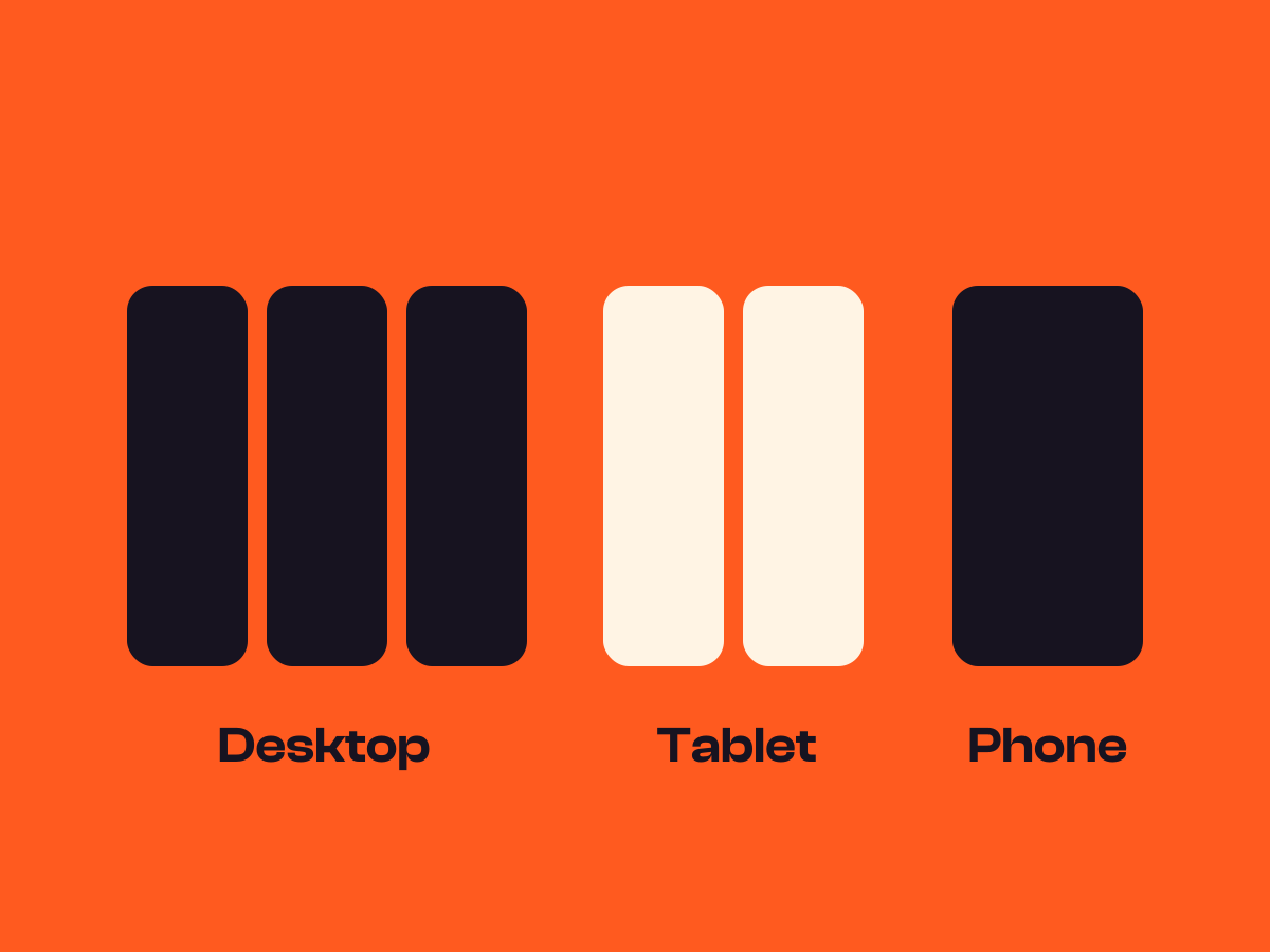
Make a section narrower on one screen than another, stack columns earlier, put two on a row on tablets, or swap the order on phones.
Type
An upgrade to Group and Columns
Find it
Block settings, Responsive
Phones
Reorders on phones only
Speed
Layout only, nothing moves

Picture first on every screen.
This is the real Per-screen width and order setting, running on this page.
Recipe of the week
Warm lattice pie
- Rub the butter into the flour until it looks like breadcrumbs.
- Add cold water, bring it together and chill for half an hour.
- Line the dish, then pile in the sliced fruit and sugar.
- Weave a lattice on top, brush with milk and bake for 45 minutes.

Settings Reverse order on mobile on Stack at Two columns on tablet
The settings worth knowing.
Widths per screen, when to stack and what comes first on phones.
240px on desktop, full width on tablet
Desktop
A width per screen
Set the largest width for desktop, tablet and mobile separately. Phones never inherit desktop.
1
2
3
4
Stack at
When to stack
Stack on mobile, on tablet and mobile, or two to a row on tablet first.
Pie night
Text first on desktop, second on a phone.
Reverse order on mobile
Flip on phones
The last column comes first once columns stack on a phone.
1
2
3
Mobile order
Any order
Give each Column, or each block in a Grid, its own place on phones, from 1 to 12.
Three steps. No new tool.
Fair questions.

Make your next site beautiful.
GrinBot designs and builds it for you. Join the waitlist for the launch price.
- Studio-quality design
- Built for speed
- Pay once, no subscription
We’ll email you about the launch. Unsubscribe any time. Privacy policy