Set columns per screen size in WordPress
Choose exactly how many grid columns show on desktop, tablet and phone, and the gaps between them. Rows can stack from the screen size you pick.
Type
An upgrade to the Group block
Find it
Grid or Row settings, Responsive layout
Phones
One column by default, or up to six
Speed
Layout only, at Grinner’s own screen widths

Six, three, then two.
This is the real Responsive layout setting, running on this page.
Primary
Secondary
Lemon Soft
Lilac
Background
Night 2
Settings Desktop (≥ 1025px) 6 Tablet (768–1024px) 3 Mobile (≤ 767px) 2
The settings worth knowing.
Columns and gaps for each screen, and when a Row stacks.
1
2
3
4
Desktop (≥ 1025px)
Columns per screen
From 1 to 6 on desktop, tablet and phone. 3, 2 and 1 by default.

Grinner Blocks
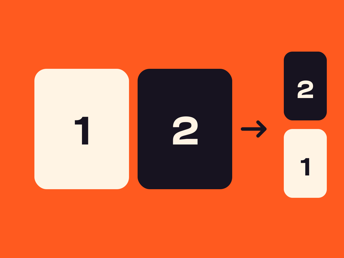
Side by side here, one above the other on a phone.
Stack at
Rows that stack
A Row switches to a vertical stack from tablet down, or on phones only.
A
B
C
Desktop gap
Gaps per screen
A spacing preset or length for each screen. A blank one takes the next larger gap.
Three steps. No new tool.
Fair questions.

Make your next site beautiful.
GrinBot designs and builds it for you. Join the waitlist for the launch price.
- Studio-quality design
- Built for speed
- Pay once, no subscription
We’ll email you about the launch. Unsubscribe any time. Privacy policy