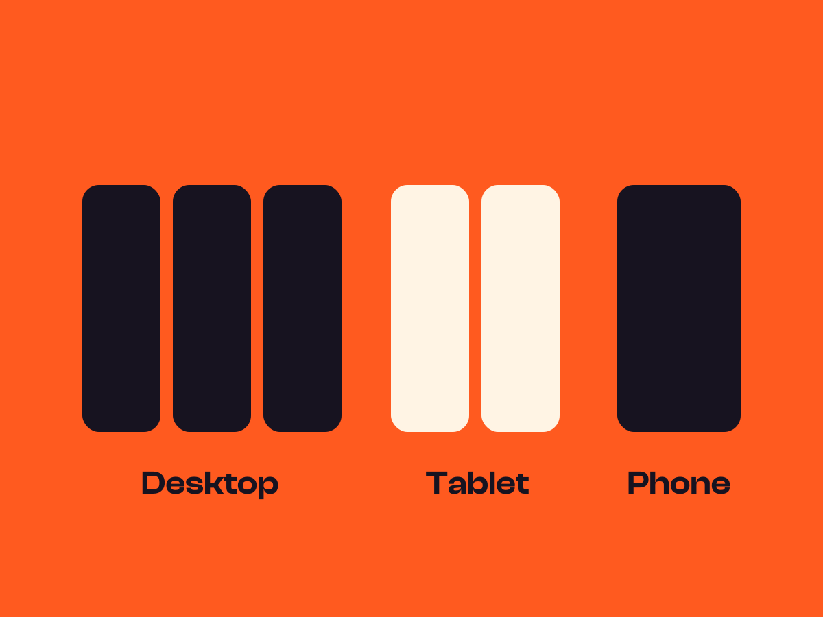
Size and tilt images in WordPress
Keep a picture to the width you want, give phones their own width and angle, and let pictures fill a grid cell, cropped neatly.
Type
An upgrade to the Image block
Find it
Image settings, Max width and Rotation
Phones
Its own width and angle on phones
Speed
Nothing animates, it’s just size and angle

Pictures that sit just right.
This is the real Image sizing and rotation setting, running on this page.



Settings Rotation (°) -4, 3, -2 Rotation on phones (°) 0 Max width 280px
The settings worth knowing.
Four settings for size, shape and angle.
120px wide
Max width
A width that holds
In px, %, em, rem or vw. For an SVG with no size of its own, it sets the size.
Max width on mobile
A width for phones
A separate width for narrow screens.
Rotation (°)
A resting tilt
From minus 45 to 45 degrees, caption included, with its own phone angle if you want one.
A tall cell, and the picture crops to fill it
Fill container
Fill the cell
Fills its parent’s width and height, cropped to fit, where the parent has a set height.
Three steps. No new tool.
Fair questions.

Make your next site beautiful.
GrinBot designs and builds it for you. Join the waitlist for the launch price.
- Studio-quality design
- Built for speed
- Pay once, no subscription
We’ll email you about the launch. Unsubscribe any time. Privacy policy