Change the logo size on mobile in WordPress
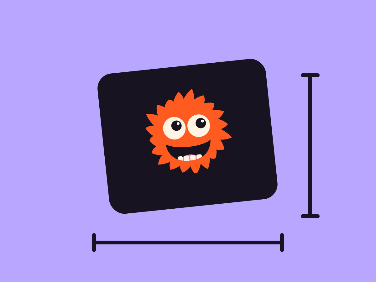
Give your site logo a separate width on phones, so a big desktop logo doesn’t crowd a small header. The height scales to match.
Type
An upgrade to the Site Logo block
Find it
Site Logo settings, Mobile width (px)
Phones
Its own width at 767px and narrower
Speed
Nothing moves, it’s just a width

Big on desktop, neat on phones.
This is the real Site logo on phones setting, running on this page.

Narrow the window below 768px to see it shrink
Settings Width 200px Mobile width (px) 90
The settings worth knowing.
Two widths, one for phones and one for everything else.
Menu
Mobile width 100px
Mobile width (px)
A phone width
From 20 to 400px, for screens 767px and narrower.
Width 200px
Width
Desktop and tablet
WordPress’s own width setting covers bigger screens.
Menu
Pinned while the page scrolls
Sticky on mobile
A compact pinned bar
Pair a smaller phone logo with a sticky header for a tidy bar that stays put.
Three steps. No new tool.
Fair questions.

Make your next site beautiful.
GrinBot designs and builds it for you. Join the waitlist for the launch price.
- Studio-quality design
- Built for speed
- Pay once, no subscription
We’ll email you about the launch. Unsubscribe any time. Privacy policy