Brand guidelines
This is the brand report GrinBot would hand over for grinner.io.
One palette, three fonts, one type scale and one voice. Everything on grinner.io is built from these, with Grinner blocks and Global Styles. Use this page when you make anything new: a page, a post, an ad or a share image.
The palette.
Eleven colors in Global Styles. Orange and lemon do the talking; cream, surface and ink do the work.
Primary
#FF5A1F
custom-primary · Ink text 5.9:1
Buttons, highlights, the Grinner face.
Secondary
#FFD23F
custom-secondary · Ink text 12.6:1
Lemon: bands, button hovers, accent words on dark.
Background
#FFF4E4
custom-background · Ink text 16.8:1
Cream: the page and light sections.
Surface
#F1E6D8
custom-surface · Ink text 14.8:1
Alternating sections and cards.
Border
#DFD5C9
custom-border · Ink text 12.6:1
Dividers and table lines.
Text
#171320
custom-text · Cream text 16.8:1
Body text, and the dark sections.
Accent 1
#B9A7FF
custom-lilac · Ink text 8.7:1
Lilac: badges and one card color.
Accent 2
#221B31
custom-night-2 · Cream text 15.2:1
Night: dark cards inside dark sections.
Accent 3
#FFE9A8
custom-lemon-soft · Ink text 15.2:1
Soft lemon: the GrinBot column and calm cards.
Accent 4
#37333B
custom-night-line · Cream text 11.4:1
Lines and borders on dark.
Primary link
#C73400
custom-primary-link · Cream text 4.9:1
Links on cream (4.9:1). On Surface, links use Text.
Rules. Use colors by name from the palette, never a typed hex value. Text on Primary, Secondary and the light colors is Ink (Text); text on Text, Accent 2, Accent 4 and Primary link is Cream (Background). The contrast figures above are WCAG ratios for that pairing.
Three fonts, one scale.
Every size is a Global Styles preset. Pick the preset by its job, not by how big it looks.
Headings, buttons, numbers
Clash Display
Medium 500 and Semibold 600 · from Fontshare, saved to the Font Library
Body text
Archivo
Regular 400 and Semibold 600 · from Google Fonts, saved to the Font Library
Accent words only
Instrument Serif
Italic 400 · one word or phrase per heading, through the serif site accent
Mega
custom-6 · 128 → 320 px
Grin
Heading 1
custom-4 · 58 → 138 px
No AI slop.
Display
custom-5 · 48 → 128 px
No AI slop.
Section heading
custom-2 · 42 → 90 px
Pay once. Keep it.
Statement
custom-3 · 31 → 81 px
The WordPress AI Builder
Article heading
custom-10 · 30 → 38 px
Built to convert, made to load fast.
Article subheading
custom-11 · 24 → 28 px
Built to convert, made to load fast.
Extra Extra Large
xx-large · 28 → 48 px
Built to convert, made to load fast.
Extra Large
x-large · 20 → 28 px
Built to convert, made to load fast.
Large (lead)
large · 19 → 24 px
Studio-quality WordPress sites, owned by you.
Medium (body)
medium · 18 → 21 px
Studio-quality WordPress sites, owned by you.
Small
small · 15 px
Studio-quality WordPress sites, owned by you.
Chip
custom-8 · 17 px
GrinBot · Coming soon
Tiny
custom-1 · 13 px
Studio-quality WordPress sites, owned by you.
Rules. Headings are Clash Display Semibold at 0.95 line height and −0.02em letter spacing. Body text is Archivo at 1.55. One serif word or phrase per heading at most. Sizes are fluid: they grow from phone to desktop on their own, so never type a pixel size on a block.
One main action, clearly.
Buttons and their hover animations
Buttons are pills in Clash Display. The main action is Primary with an arrow, and its hover slides in lemon. The second action is an outline. One main button per section.
On a dark section the outline turns cream. Links read in cream too.
Links
Links in running text use Primary link, a deeper orange that reads at 4.9:1 on cream, with no underline and a lemon hover. On Surface, dark and colored sections, links take the section’s text color.
Links to other grinner.io pages can show a preview card on hover: see Moodkit or the story behind Grinner.
Round, never sharp.
Four corner sizes. Big friendly pills for anything you press; soft 24 px cards for everything you read.
Pill · 999px
Buttons, chips, badges, the email field.
Card · 24px
Cards, pricing cards, image frames.
Table and panel · 20px
Comparison tables, dark panels.
Small · 14px
Small cards inside cards, swatches on phones.
Five section styles.
Each one sets the background, text, links and buttons together, so nothing needs a color picked by hand.
Light section
The default. Cream with ink text. A link.
Surface section
For alternating bands: comparisons, pricing, FAQs. A link.
Dark section
Heroes and the closing call to action. Lemon accent words. A link.
Lemon band
For bands of moving words and one bright card. A link.
Lilac card
For one card that needs to stand apart, never a whole section. A link.
Two faces, one grin.
Grinner is the plugin. GrinBot is the AI builder that uses it. They share a smile, never a logo.

Grinner logo
The plugin and the company brand: the orange Grinner face and the cream wordmark.
- Only on dark: Text or Accent 2. The wordmark is cream.
- At least 120 px wide, with clear space the height of the face all around.
- Never recolor, stretch, outline or add a shadow.
- In the header it links to the homepage.

Grinner face
The mascot on its own, for stickers, calls to action and the plugin icon.
- Works on any palette color, light or dark.
- It may rock or float gently; it never spins or bounces.
- One face per section at most.
- No speech bubbles or extra limbs.
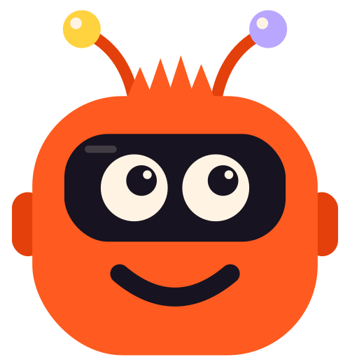
GrinBot
The AI builder’s own mascot: a robot with the Grinner grin.
- Always written “GrinBot”, with a capital G and B. Slugs stay lowercase: /grinbot.
- Use it for GrinBot pages, the waitlist and GrinBot cards; Grinner for the plugin.
- Never put GrinBot and the Grinner face in one lockup.
- It floats; it doesn’t talk or wave.
Building blocks, in our style.
The Grinner effects grinner.io uses, set up in the brand. Motion is still on phones and for anyone who asks for reduced motion.
Site accents
A serif word, a lemon marker, a Status, a Coming soon, a $99 and a Setting label.
Headline motion
The WordPress AI Builder, but
Text Rotator, Pixel reveal. Headings also use Blur in, Word by word and Grey to Colour (on scroll).
Your goal in, a site built to convert out.
Cards
Card Mode
Cream card, 1 px ink border, hover to lift.
Lilac card
One card in Accent 1 for the thing that matters most.
Aurora card glow
A dark card with an orange flame rising from one corner, inside an animated orange-to-lemon gradient border.
Animated backgrounds from Motionkit
Star and burst · homepage hero
Night glow · Moodkit hero
Flower · Motionkit hero
Night glow, slow · other heroes
Stickers and more
Stickers
Small stars float and spin around heroes and calls to action. Hidden on phones.



Also on grinner.io: sticky scroll cards for the six steps, a hover reveal list for features, a before and after slider on Moodkit and a live wall of animated backgrounds on Motionkit.
How we sound.
Friendly, direct and a little cheeky. A good studio talking to a busy web designer.
We do
- Plain words and short sentences. US English.
- Write “GrinBot” with a capital B, and say “waitlist”.
- Say the price: $99 one-time, $199 for unlimited sites.
- Use real, measured numbers, and say when they were measured.
- Say GrinBot works like a studio.
- Be honest about what GrinBot can’t promise, like speed on any host.
We don’t
Sounds like
“Studio-quality, conversion-focused WordPress sites made for speed, built by AI and owned by you.”